Apple released quarterly results for their fiscal third quarter yesterday. While a tremendous amount of ink has been spilled dissecting every ounce of the most recently concluded quarter as well as pontificating about the implications, I thought it worthwhile to look back over the last 15 quarters to see if any insights might be gleaned. Here are few nuggets:
On Unit Volumes
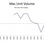
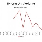
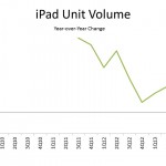
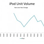
Apple reports quarterly unit sales for iPhone, iPad, iPod, and Macs. All, but iPhones experienced a unit volume decline in the fiscal third quarter on a year-over-year basis. iPhone sales were up 20 percent on a year-over-year basis – driven in part by international growth. Mac sales were down 6.6 percent – the third consecutive quarter of year-over-year declines. Sales are off about 4.5 percent over the last three quarters. iPad sales slipped 14.2 percent on a year-over-year basis – the first quarter to experience a decline in sales. Apple suggested the decline was primarily driven by tough year-over-year declines. As the chart below illustrates, the iPad sales growth on a year-over-year basis has been slowing over the extended time period as the product category matures. Growth in the second fiscal quarter was 65 percent on a year-over-year basis. Even comparing 3Q13 unit volume to 2Q12 unit volume shows a growth rate of 23 percent. iPod sales declined 32 percent on a year-over-year basis and have been in decline since at least the close of 2010.
One Average Selling Prices
Because Apple reports both unit volume and revenues for the segments for which they provide breakout details, one can also look at changes in realized prices over an extended period of time. Beginning in the fourth fiscal quarter of their 2011 fiscal year, Apple changed slightly how they report revenue for the four hardware categories for which they provide a breakout. While they had previously included product specific accessories in the reported category revenue (ie iPad accessories in the iPad category), they stopped doing so with the first fiscal quarter for their fiscal year 2012. The prior inclusion of revenue for these accessory categories essentially inflates the average price (because it increases reported revenue without a corresponding change in units sold) so take that into account when looking at average price information. With that said, year-over-year information for the last three fiscal quarters is a like comparison. For the fourth fiscal quarter of 2012 Apple reported results in both ways. The average iPhone price is about $18 less under the current method and the average iPad price is about $27 less. I believe these figures also provide a rough estimate of the dollar value of accessories purchased by consumers.
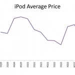
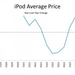
Price changes over the last 15 quarters provide interesting insights into the evolution of these categories. Quarterly sales for iPod were down 32 percent from a year ago, 39 percent from two years ago, and over 50 percent from three years ago. At the same time, the average price has increased slightly (up 2 percent on a year-over-year basis). While unit volume is down significantly, the units they are selling have a slightly higher price. This could simply be an iPod Touch story (raising the average selling price) – though the average iPod price is very close to the price of the iPod Nano. iPod prices remain nearly ten percent below their high.
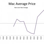
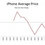
Mac prices have actually been up for three consecutive quarters on a year-over-year basis and were up over six percent in fiscal Q3 – though they remain about 5 percent below their highest quarter. Conversely, iPhone prices were down roughly 4.4 percent on a year-over-year basis and have fallen for six consecutive quarters. Prices are down about 12 percent from their peak.
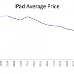
The biggest change in average price come from the iPad category where average prices have fallen nearly 35 percent from their peak. Prices were down 15 percent on a year-over-year basis in fiscal Q3 – consistent with recent quarters. This price story tells perhaps the richest story and highlights the evolution within this category. When iPad first launched, cellular connected tablets were a significant share of sales but as usage patterns became more solidified consumers came to learn more clearly how they would use tablets. As opposed to devices that you frequently used in a mobile-connected setting, they became devices that one uses more heavily in a static location (like a home or office) where Wi-Fi is readily available. Wi-Fi networks have at the same time become more prevalent. Perhaps the long-run decline in price is also a story of consumers shifting more tablet activities to the cloud and therefore requiring less storage on their devices. At the same time Apple did most recently introduce a model with 128GB of storage. Price declines in recent quarters are clearly a sign of composition shift – as consumer adopt the smaller screen (and lower priced) iPad mini.

